
Design a Daffodil Sticker in Procreate Even If it’s Ugly
Have you ever wondered how to create beautiful digital art with Procreate, but felt a little overwhelmed? As a beginner myself, I recently worked on learning to design a daffodil sticker using Procreate.
It’s a journey full of experimenting, learning, and fixing mistakes, and I’m here to share the process and tips with you.
From setting up to finishing touches, let’s break it all down into manageable steps.
Starting with the Camera Setup
**If you have no need to record your drawing feel free to skip ahead!
Creating art while recording your process adds a unique challenge. This project was my first attempt at hooking up a camera directly to my computer to record my screen.
My phone ran out of storage very quickly so my husband attached my camera to the computer to record with it.
I'm still working at getting the picture and lighting right. The initial footage had some blurring over the layers section which I haven't figured out a way around yet.
If you’re planning to try something similar, be prepared for a bit of troubleshooting.
Keep practicing and it should get better with time and patience.
If you do not need to record, lucky you, disreguard and pass on the headache!
If this all sounds like too much work and you would rather just buy some cute stickers be sure and check out the Doodle and Design Studio Shop.
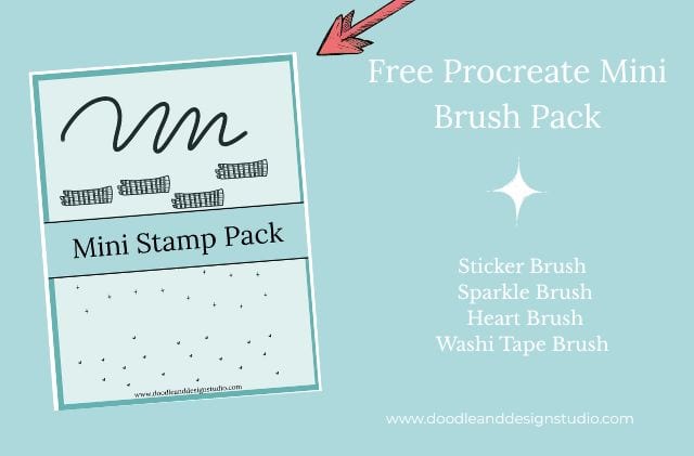
Want to follow along with this tutorial?
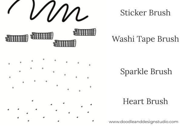
I made a free Procreate brush pack that includes a beginner-friendly sticker brush and 3 stamp brushes

The Artwork and Background Challenges
For this project, I decided to focus on daffodils. We are headed into Spring and the daffodil is the flower for the month of March so it sounded like a good idea!
I popped over to pinterest and looked at some photographs of daffodils to get inspiration for my drawing.
Then I started with a custom watercolor background I’d purchased, thinking it would add a nice touch.
What I didn’t realize was how tricky it would be to work with that background.
Check out How to Design Stickers in Procreate where I go into more detail about dealing with those pesky backgrounds!
So far I have found with textured papers they have to be on the top layer in order to show the texture.
This means when you go to get rid of your background to export as a transparent PNG the textured paper will show up in all it's glory.
It will be on the areas surrounding your sticker as well as under your sticker where you actually want it.
It's those areas all around your sticker where we want a transparent background that make it a pain to try and get rid of while keeping texture on the drawing.
Now if you are just creating a drawing that is fine, if you are wanting a sticker you are going to have the paper texture showing up outside your sticker.
I have not found any quick work arounds for this, yet.
So the only thing I have found is to free form trace your entire sticker with the select tool and copy and paste your art onto a new layer. This takes forever.
Let me know if there is an easier way!
Using Layers to Build Depth
If you’re new to Procreate, layers are going to be your best friend.
I mean who wouldn't want to color on a different layer for everything so you can go back and fix any mistake?
For this design, my workflow included several layers:
- Line Art: The top layer contains the clean outlines of the flowers.
- By lowering the opacity of the line art or sketch layers and using the “Multiply” blending mode, I could see the original sketch through as I worked on adding depth and dimension.
- Base Colors: Colors like orange, yellow, and green were each added on separate layers underneath the line art. One layer could also contain all the base colors, depending on preference.
- Highlights and Shadows: New layers were clipped to the base color layers for detailed shading and bright spots. Select the correct layer and choose “clipping mask” from the pop up menu.

Adding Highlights That Pop
To make the artwork truly come alive, I focused on adding highlights. Here’s how I worked with the base yellow layer:
- Added a new layer above the yellow base and applied a clipping mask.
- Selected a lighter shade of yellow from the Procreate color disc.
- Used a watercolor brush to add soft highlights to the daffodil petals.
Pro tip: Switching your layer mode to “Add” makes those highlights even brighter.
It’s like giving your colors an extra glow, you will want to play with the opacity of the layer to get the correct hue. At first it may slightly blind you!
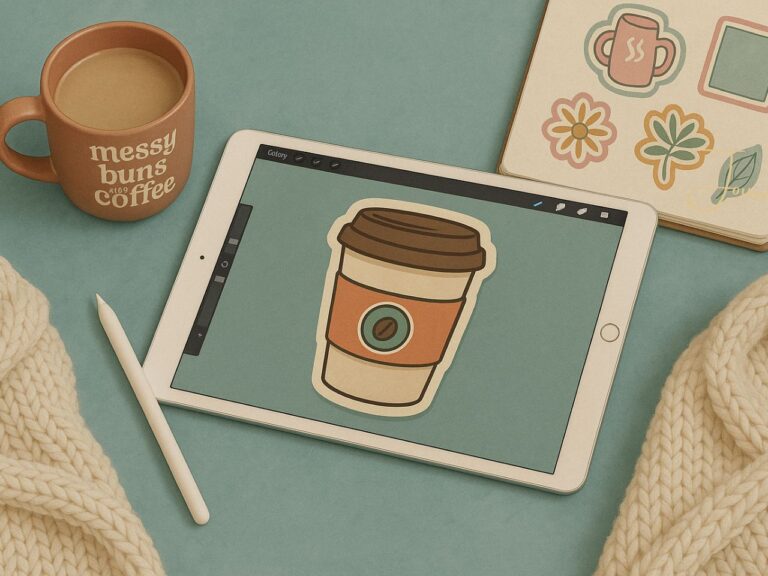
Want to try designing your first Procreate sticker?
Grab my free Sticker Brush Mini Pack with 1 custom brush and 3 fun stamps to kick off your creative chaos.
Experimenting with Watercolor Glaze Effects
One of my favorite tools to design a daffodil sticker was the watercolor glaze brush.
Now I did purchase this specific brush but there are several different texture brushes that come with procreate you can experiment with.
After scaling the brush to the right size, I swiped across the petals and stems, bringing a soft, authentic watercolor effect to the piece.
If you’re attempting this, don’t be afraid to play around with brush styles. You might like a rougher brush for texture or a smoother one for blending—it’s all about finding what feels right for your style.
Building Shadows for Depth
Now, let’s talk about shadows. This helps your daffodil sticker with definition and not look so flat on the page. Here’s what I did:
- Added another clipped layer above the base yellow and switched to a darker tone of the same color.
- Worked along the color gradient to avoid that “muddy” look shadows can sometimes get. So instead of going directly down for a darker yellow, I went for a more saturated yellow.
- Applied similar techniques for the orange base layer, darkening shadows around the petals and stems.
Remember to take it slow with shadows—smooth blending from light to dark creates a natural look.
Keep It Organized: Naming Your Layers
I’ll admit it—I didn’t name all my layers. I am my own worst enemy.
With so many layers involved, things can quickly spiral into chaos if you don’t stay organized.
Speaking of chaos, I designed a a cute cloud and rainbow sticker , with my new mantra, “Embrace the Chaos”on my you tube channel you should definetly check out!
Naming each layer keeps your workspace neat, so you’re not wasting time clicking and guessing. Or you can be like me and consistenly color on the wrong layer.
Naming tip: Use simple, descriptive labels like “Base Yellow,” “Petal Shadows,” or “Line Art.”
Removing the Reference and Background
Once you are happy with your daffodil design, it’s time to clean up. For me, this included turning off the original reference sketch to let the new details show.
I also had to wrestle with removing the custom watercolor background, which had caused trouble early on.
So as I mentioned earlier the only thing I have found is to free form with the select tool and copy and paste your art onto a new layer.
The texture is just so good under the colors, you would think I would learn my lesson. Alas, I'm a sucker for a good texture. Don't be like me unless you want to drive yourself insane and waste the precious time you have to create.
Once the art was on a new layer,what felt like three years later, I had to copy and paste into a new canvas as the texture paper will still be on top in the original.
Once in the new canvas, I created a white backdrop to help bring focus to the daffodils.
By duplicating existing layers, applying a Gaussian blur, and using the selection tool to invert, I built a framed white border.
I go through this step by step in the video at the top of the article. If you want step by step instructions make sure to check it out.
Once your white border is created you can delete the blurred image and move the white layer under your artwork and you should have a white border behind your daffodil sticker.
Tadah! Sticker outline!
Need A Break?
Why Not Pause and Sign up for Doodle and Design Studio Newsletter and Grab some Free Stickers? Here is the sign up!

Adding Texture for That Final Touch
Textures can really add that extra wow factor to your stickers.
To give the daffodil sticker a more polished feel, I spent time layering texture effects using watercolor brushes.
So yes, I had the watercolor paper texture and I decided I needed even more texture.
The added detail not only made the design more engaging but gave it a hand-painted look—the kind of charm that’s perfect for a sticker.
Take this step as your opportunity to explore your creativity.
Whether you add tiny grainy textures or bold strokes, think about what enhances the aesthetic of your work.

The Sticker Dilemma: White Border vs. Transparency
Once I had the white border I wasn't sure I liked it. I would kind of like to see this sticker on clear sticker paper. Ultimately, it’s all about style preference.
A clean white border frames your artwork, while transparency can create a softer see through effect. I tested both and ended up using an earlier design printed on watercolor paper.
**The daffodil stickers finally got back from the manufacture, as you can see in the photos.
I am not in love!
That's ok, I still improved my skills. It's all good. You definetly have to learn not to be too attached to your creations.
And because I love you, I'm even showing you my sad trash daffodil sticker design.
Did I mention I bought 100 of these darn things? They looked pretty ok on the computer.
I probably won't repurchase from this supplier but I'm also taking most of the blame.
Being new and not knowing any better, I'm sure I could have designed this sticker better for printing.
However there packaging left something to be desired. I purchased 400 stickers and they bent and shoved them all into one tiny bubble mailer.
Practice Makes Perfect
As you can see if you watched my video this wasn’t a perfect process.
Hunting for that unwanted yellow circle in my layers took longer than it should have, and I haven’t even mentioned the small hiccups with merging layers.
Are you just starting out too? Keep practicing. Trust me, the more time you spend experimenting in Procreate, the more confident you’ll feel.
There’s no rush to get it all right on the first try and learning to design a daffodil sticker is great practice.
Who knows maybe you will create a trash daffodil too and we can become best friends!
Let Your Creativity Take Over
Designing a daffodil sticker isn’t just about creating art; it’s about having fun with the process. Sure, there’s a lot to learn—from figuring out designs that print well to mastering Procreate tools.
But at the end of the day, it’s super rewarding to look at your finished work and say, “I made this” or “I increased my creating muscles”.
If you’re feeling inspired, why not try creating your own daffodil sticker (or any design that sparks your creativity)? The tools are all there—you just have to dive in.
What in the world to do with stickers you create?
Check out Stickers as a Creative Outlet for lots of great ideas!
Want more digital art tips like these? Be sure to check out my YouTube channel for step-by-step tutorials and plenty of mistakes to laugh (and learn) from. Let’s create something amazing together!
Ready to try your own sticker design?
Download the free Procreate brush pack made for beginners includes my starter stamps + sticker brush and a quick-start guide.
👉Fill in the form to get instant access.
Want More Procreate
Whether you’re just starting out or ready to try your next cute design, here’s a full list of tutorials, tips, and easy wins for making stickers in Procreate:
Start Here: Beginner-Friendly Guides
- Procreate Beginner Guide for Stickers
- Making Stickers in Procreate for Beginners
- How to Design Stickers in Procreate
- How Procreate Stickers Boosted My Confidence as a Creative Mom
- How Procreate Helped Me Reconnect with Creativity
- What I Learned from Trying A Daily Sticker Sketch Challenge(and Failing Sometimes Too)
Learn Cute Sticker Drawing Techniques
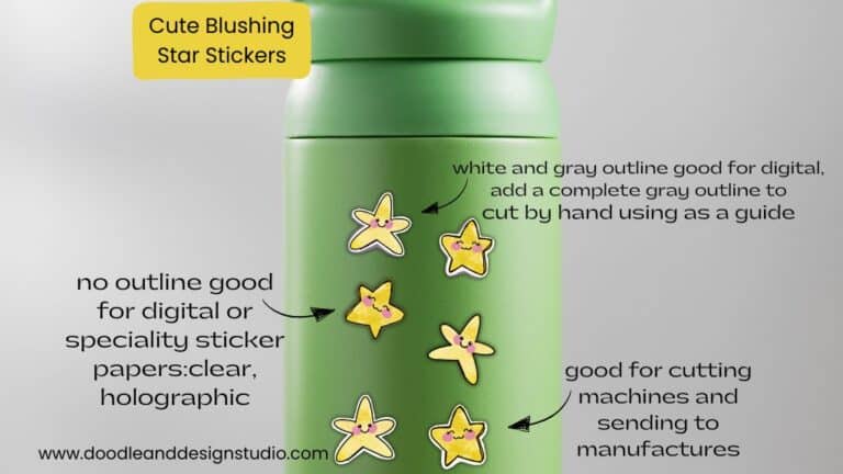
- Draw a Cute Blushing Star Sticker
- Designing a Cute Bunny Sticker
- How to Draw Cute Cherries
- Draw a Cloud in Procreate (Easy!)
- Design a Daffodil Sticker in Procreate
- Draw a Baby Duck in Procreate
- How to Make Your First Digital Sticker in Procreate (In 10 Minutes!)
- 3 Easy Outline Effects in Procreate That Make Your Stickers Pop
Procreate Tools, Ideas & Tips
- Easy Procreate Sticker Ideas
- Sticker Making Tips in Procreate
- Procreate vs Canva for Sticker Design
- How to Design Stickers
- Procreate Tools for Sticker Design: The Beginner’s Guide for Burnt-Out Moms
- Using Layers for Stickers in Procreate
- Clipping Masks For Procreate Stickers (with Less Stress and More Fun!)
- Best Canvas Size for Procreate Stickers (Beginner Guide)
- Best Procreate Brushes for Stickers (Free & Paid)
- Resizing Stickers in Procreate: The Busy Mom’s Guide to Sanity, Success, and Not Losing It
- Procreate Color Palettes for Stickers, Effortless Sticker Color Magic
- Eraser Tool Tips for Procreate Stickers (That Even Exhausted Moms Can Master)
I have also created an entire Procreate Starter Kit with a complete sticker file so you can see exactly how I made it!
Be sure to share your favorite Pin to your Pinterest Sticker Board so you never lose it!