
Why Your Digital Art Looks Worse Than Your Pencil Sketches (And How to Fix It Fast)
If your digital drawings look stiff, wobbly, or “not like you,” it’s not because you suddenly forgot how to draw. You’re building digital drawing skills on top of the art skills you already have, and that stack takes a minute to settle.
The good news is that digital art isn’t harder because you’re bad at it, it feels harder because there are extra rules nobody warns you about.
Once you understand why your lines feel weird, why your colors look off, and what to practice (in a simple order), you can stop feeling like every session is a personal roast and start making art you’d actually put on a product.
- Your pencil skills didn’t disappear — you’re translating them to a slick screen + digital tools.
- Wobbly lines usually come from no friction + zooming in way too far.
- Fix it fast: add friction (matte protector), use light stabilization, and zoom out more.
- Stop the undo spiral: do a 5-minute “no undo” sketch layer, then refine on a new layer.
- Want cleaner art? Focus on brush control, layer sanity, and value checks before color.

Table of Contents
Why digital drawing feels so hard at first
You’re learning art and tech at the same time
With pencil and paper, your brain isn’t wasting energy on settings, menus, and gestures. You just draw. Digital art asks you to do two jobs at once: make the drawing, and run the tool.
It’s like this:
- Traditional drawing feels like riding a bike you learned years ago, your body knows what to do.
- Digital drawing can feel like trying to write a note while setting up a printer at the same time, there are buttons, options, and tiny decisions everywhere.
Even if you’ve drawn your whole life, your “traditional muscle memory” doesn’t automatically transfer to a tablet. Your hand control might be great on paper, but the second you switch surfaces, stylus feel, and brush behavior, your lines can go a little feral.
If you’re using Procreate and it still feels like too many buttons, you’ll feel calmer fast with Procreate basics for beginners. The goal is not to learn everything, it’s to learn the few things you’ll use every session so you can get back to drawing.
One more thing that helps mentally: treat digital art like a new instrument, not a judgment on your talent. You’re not starting over, you’re translating.

If you’re overwhelmed, start here: Free Digital Drawing Guide
If Procreate still makes your brain glitch, and because it has cute drawing prompts, grab this: Digital Drawing without the Overwhelm. You’ll focus on a few simple tools, small finishable pieces, and building confidence without pressure.
The tablet surface messes with your control
The first time you draw on a tablet, the glass can surprise you. Paper has tooth. It grips your pencil just enough to steady your hand. A tablet is slick, so your hand shows every tiny hesitation.
Your brain expects friction, but the screen says, “Nope, we’re ice skating today.”
That’s why your lines can look wobbly, your curves feel shaky, and you suddenly zoom in way too far because you’re trying to “fix it” with precision instead of flow. That panic is common, and it’s not a sign you’re not cut out for digital art.

Fix wobbly lines without losing your style
Add friction, then use smoothing on purpose
You don’t need to “tough it out” while the screen feels slippery. You can make the surface and the tools work with you, especially while you’re learning.
Here are three quick fixes you can try right away:
- Try a matte screen protector if you like texture. It adds that paper like drag so your stylus doesn’t feel like it’s sliding around. I use and love the Paperlike Screen Protector.
- Turn on stabilization (but keep it low). A little smoothing can help you learn without hating every line you make. You still want to build control, not outsource it.
- Zoom out more than you think. Clean lines usually come from arm movement, not tiny wrist circles. When you zoom in too far, you start drawing like you’re building the line one pixel at a time.
If you want to understand what brush settings are actually doing (instead of guessing), the Procreate Brush Studio settings guide explains how Procreate builds strokes and which controls affect the feel of your lines.
And if you’re trying to draw faster without getting messy, it also helps to focus on a few tools you’ll reuse constantly, not fifty random features. This breakdown of Procreate tools to draw faster fits perfectly with a clean line workflow, especially once you start making product-ready art.

Escape the undo spiral with a five minute rule
Undo is the best and worst part of digital art.
It feels amazing at first because you can fix anything instantly. Then it quietly trains you to doubt every stroke. You redraw the same line again and again, not because it’s wrong, but because you can.
When you never commit to a line, you never build confidence. So try this simple reset:
Sketch on one layer. Set a timer for five minutes. No erasing, no undo, just drawing. When the timer ends, then you can clean it up on a new layer.
This does two important things at once. It forces you to stay in motion (which makes lines smoother), and it teaches you to make decisions instead of hovering in perfection mode.
If you catch yourself zoomed in so far you’re basically repairing pixels, make that part of your “done rule” too. Zoom is useful, but living inside zoom is how a ten minute doodle turns into a two hour stress session.

The 3 digital skills that make your art look clean
Brush control beats brush shopping
A fancy brush pack won’t save you if your pressure control is inconsistent. When you see an artist making gorgeous line work with a special brush, you’re usually seeing the result of practice, not the brush itself.
Start simple. Pick:
- One brush for sketching
- One brush for line art
- One brush for shading
Then do one week with the same brushes. You’re training your hand to understand how that brush tapers, how it reacts when you speed up, and how much pressure gives you the look you want.
This matters even more if you want to sell your art, because your customers will notice consistency. Clean lines and predictable texture make your work feel intentional, which makes it feel more professional, even if your style is simple and cute.
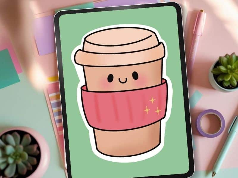
If you want a quick project where you can practice clean shapes without overthinking, make your first digital sticker in Procreate. It’s the kind of small win that builds real momentum.
💡Want to Start Selling Your Art?
The Art to Income Membership gives you one beginner-friendly project each month, trend ideas, templates, and step-by-step help — so you’re not stuck wondering what to make or how to start.
Perfect if you’ve got an iPad, some creativity, and no clue what you’re doing (yet). We’re all figuring it out together, one small win at a time.
🎨 Join the Membership for $17/monthLayers are amazing, until they become chaos
Layers are one of the biggest perks of digital art. They’re also a fast way to feel lost.
If layers were an object, they’d be a rainbow cake. Fun, stacked, beautiful, and easy to turn into a messy pile if you don’t keep track.
A simple layer setup that stays manageable looks like this:
Sketch on one layer, clean line art on one layer, one layer per flat color, one layer for shadows, one layer for highlights, and one texture layer if you want it.
The real secret is boring but true: name your layers. Name them early, not after you have twenty layers called Layer 12, Layer 18, and Layer 18 copy.
When you’re making product art, layer names save time. Time matters when you’re creating sticker sets, planner icons, or print collections. You don’t want to waste your creative energy hunting for the one layer that has the face blush on it.
Screens lie about color, so check values first
Backlit screens make color look extra punchy. That glow can make your palette feel too bright, too gray, or weirdly neon compared to what you expected.
A simple habit that helps fast is checking your art in grayscale. Grayscale shows you values (light and dark) without the distraction of hue. If everything turns into the same mid gray, your contrast is too low, and your shapes won’t read clearly.
Then simplify your palette. Use fewer colors, build light and dark versions of those base colors, and save that palette so you can reuse it.
A consistent palette is also a branding shortcut. When your products share the same color family, your shop starts to look cohesive even if each design is different.
If you want help generating palettes quickly, Coolors palette generator makes it easy to create a small set you can stick with while you practice.

A 4 week practice plan that actually stacks
Pick one focus per week, so you stop spinning your wheels
Random practice feels productive because you’re busy. But it often doesn’t add up, because you’re jumping between skills without giving your brain time to lock anything in.
Try one focus per week instead:
- Week 1, cleaner sketches: Zoom out more, hit undo less, aim for movement over perfection.
- Week 2, confident lines: Use the same line brush daily and practice steady strokes.
- Week 3, flat colors and clean edges: Limit your palette, focus on crisp fills and simple shapes.
- Week 4, shading and highlights: Keep one clear light direction, do tiny light source studies, and repeat.
This works because each week builds on the last. You’re not trying to improve everything at once, you’re teaching your hand one skill, then stacking the next.
have you joined the art to income: create & Sell digital products facebook group?
If you’ve ever said, “I want to draw digitally, but I have no idea where to start,” this is your sign.
We learn Procreate tricks, share designs, celebrate tiny wins, and cheer each other on as we start selling what we make.
💕Join Us on Facebook✨
Practice what you actually want to sell
Your practice should match your product goals, because different products reward different strengths.
If you need a simple, friendly walkthrough that matches sticker goals, how to design stickers keeps the process manageable and product-focused.
Set a done rule before you start, so perfectionism can’t drive
Perfectionism is a time thief, especially when you’re trying to build a shop or create consistent digital products.
The point is not to make art that feels unfinished. It’s to stop adding endless extras that don’t actually improve the product.
A customer buying stickers or icons wants clear, cute, and usable. They don’t need you to spend three hours detailing something that prints at one inch tall.

Turn digital practice into sellable products
When your digital art starts to feel more stable, you can turn practice pieces into real listings faster than you think. A weekly focus plus a done rule creates finished work, and finished work is what builds a shop.
If you’re already selling (or you posted a few listings and heard crickets), it helps to remember that “good art” is only one piece of the puzzle.
Your product can be strong and still get buried if your shop setup is unclear. This guide on digital products not selling is a solid reminder that a quiet shop usually has fixable issues that are not about your talent.
And if you want a low pressure practice piece that can turn into a product quickly, try a small sticker design like a fruit, a simple icon, or a cozy object.
You can follow a full example with the Procreate strawberry sticker tutorial, then swap the subject to match your own style.
Because the tablet is slick, your brush reacts differently than graphite, and you’re learning new tools + gestures while trying to draw. That’s two jobs at once — so yes, it feels harder at first.
Add friction (matte screen protector), use stabilization lightly, and zoom out more. Smooth lines usually come from arm movement, not pixel-level surgery.
Nope. Keep it low. You want support while you build control — not a robot line that doesn’t look like you.
Use your 5-minute rule: sketch on one layer for 5 minutes with no undo. Then refine on a new layer. Motion builds confidence fast.
Start with: (1) sketch confidence, (2) line control, (3) flat colors + clean edges, (4) simple shading. One focus per week = real progress.
If your digital art looks worse than your sketchbook right now, that’s normal. You’re adjusting to a slick surface, new tools, and a workflow that rewards different habits.
Keep it simple: add a little friction, use stabilization with intention, practice with the same brushes, limit your palette, and follow a weekly focus so your skills stack instead of scatter.
Then set a done rule and ship the art, because finished work is how you grow both your confidence and your product line.
What feels hardest for you right now, lines, layers, or color?
Interested in hitting the easy button for your art? You can grab the birth flower Procreate stamp set featured in these images right over here in my Etsy shop .

🎨 Art to Income Membership
Turn your doodles into dollars — one simple, sellable project at a time.
If you're staring at Procreate wondering how people go from drawing frogs in sweaters to actually selling stuff — you're not alone.
This membership helps you go from “where do I even start?” to having a finished product ready to list.
Each month you’ll get:
💖 One guided project to create and list a finished product
💖 Done-for-you assets to speed things up
💖 Trend + keyword ideas so you know what people are actually buying
💖 A supportive group of artists figuring it out right alongside you
💖 Listing and promo ideas so your art doesn’t just sit in a folder
You don’t need to be techy, trained, or totally “together” — just curious enough to try.
🎥 Prefer to learn by watching?
I’ve got a YouTube channel full of quick, no-pressure tutorials made for tired, creative souls like you.
Subscribe here and catch your next creativity boost, one sticker at a time.
Love and messy buns,
❤️
Cynthia McDonald
Helping women find creativity in the chaos — with stickers, stationery, and a little bit of fun
This post may contain affiliate links. I may earn a commission if you make a purchase at no extra cost to you.
Make sure and grab your favorite Pinterest Pin and Save it to your Digital Art Pinterest Board


